
Transparent Aesthetic Folder Icons Collection: Organize Your Digital World with Style
In today’s digital age, organizing our files and documents efficiently is essential for productivity and peace of mind. Imagine having a clutter-free desktop or file explorer where everything is neatly arranged and visually appealing. That’s where transparent aesthetic folder icons come into play, offering not just functionality but also style to your digital workspace.
Table of Contents
| Sr# | Headings |
|---|---|
| 1 | What are Transparent Aesthetic Folder Icons? |
| 2 | Benefits of Using Transparent Folder Icons |
| 3 | How to Install Transparent Folder Icons? |
| 4 | Where to Find Quality Transparent Icons? |
| 5 | Customization Options for Folder Icons |
| 6 | Compatibility with Different Operating Systems |
| 7 | Tips for Choosing the Right Folder Icons |
| 8 | Maintaining Consistency in Icon Design |
| 9 | Incorporating Folder Icons into Workflow |
| 10 | Future Trends in Folder Icon Design |
What are Transparent Aesthetic Folder Icons?
Transparent aesthetic folder icons are graphical representations used to identify and categorize various files and directories on your computer or mobile device. Unlike traditional folder icons, which often come in solid colors or predefined designs, transparent icons blend seamlessly with any background, providing a clean and minimalist appearance.
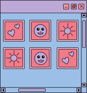
These icons typically feature subtle outlines or accents that make them visually appealing without overwhelming the user interface. Whether you’re organizing work documents, personal photos, or creative projects, transparent folder icons offer a modern and sophisticated touch to your digital environment.
Benefits of Using Transparent Folder Icons
- Enhanced Visual Organization: Transparent folder icons help you categorize and locate files quickly, reducing clutter and improving workflow efficiency.
- Personalization: With a wide range of designs and styles available, you can customize your folder icons to reflect your unique personality and preferences.
- Improved Aesthetics: The sleek and minimalist design of transparent icons adds a touch of elegance to your desktop or file explorer, creating a more visually pleasing experience.
- Consistency Across Platforms: Transparent icons maintain their visual integrity across different operating systems and devices, ensuring a cohesive look and feel across your digital ecosystem.
How to Install Transparent Folder Icons?
Installing transparent folder icons is a simple and straightforward process, regardless of your operating system. Follow these steps to customize your digital workspace:
- Download the Icon Pack: Choose a reputable source for transparent icon packs that align with your aesthetic preferences.
- Unzip the Files: Once downloaded, unzip the icon pack files to reveal the individual icon images.
- Select the Icons: Browse through the icon collection and choose the ones you wish to use for your folders.
- Apply the Icons: Right-click on the folder you want to customize, select “Properties,” and navigate to the “Customize” tab. Click on “Change Icon” and browse to locate the downloaded icon files.
- Save Your Changes: Confirm your selection and save the changes to apply the transparent folder icon to your folder.
Where to Find Quality Transparent Icons?
Finding quality transparent icons can be a daunting task with numerous websites and platforms offering icon packs. To ensure you get the best icons for your needs, consider the following sources:

- Icon Marketplaces: Explore reputable icon marketplaces such as Iconfinder, Flaticon, or Noun Project, which offer a vast selection of high-quality transparent icons for download.
- Designer Communities: Engage with designer communities and forums where talented artists share their creations and offer custom icon packs for purchase or free download.
- Social Media Platforms: Follow designers and artists on social media platforms like Instagram and Dribbble, where they often showcase their latest works and provide links to download their icon sets.
Customization Options for Folder Icons
One of the key advantages of transparent folder icons is the ability to customize them according to your preferences. Here are some customization options to consider:
- Color Palette: Choose a color palette that complements your desktop theme or branding.
- Icon Style: Explore different icon styles, such as flat design, line art, or skeuomorphic, to find the perfect fit for your aesthetic.
- Icon Size: Adjust the size of the icons to ensure they are visually proportional and easy to identify within your file explorer.
- Overlay Effects: Experiment with subtle overlay effects or shadows to add depth and dimension to your folder icons.
Also, check aesthetic folder icons collection and aesthetic folder icons pack.
Compatibility with Different Operating Systems
Transparent folder icons are designed to be compatible with a wide range of operating systems, including Windows, macOS, and Linux. Whether you’re using a desktop computer, laptop, or mobile device, you can seamlessly integrate transparent icons into your digital workflow without any compatibility issues.
Tips for Choosing the Right Folder Icons
When selecting transparent folder icons for your digital workspace, consider the following tips to make informed decisions:
- Clarity and Readability: Choose icons that are clear, legible, and easily recognizable at various sizes and resolutions.
- Consistency: Maintain consistency in icon design and style to create a cohesive visual hierarchy within your file organization system.
- Icon Functionality: Ensure that the icons effectively communicate the contents or purpose of the folders they represent, helping you navigate your files with ease.
- User Feedback: Solicit feedback from colleagues, friends, or online communities to gather insights and recommendations on suitable icon designs.
Maintaining Consistency in Icon Design
Consistency is key to creating a visually appealing and intuitive file organization system. Here are some strategies for maintaining consistency in icon design:
- Unified Theme: Choose a unified theme or visual style for your transparent folder icons to create a cohesive look and feel across your digital workspace.
- Icon Size and Proportions: Ensure that all icons are consistent in size and proportions to maintain visual balance and harmony.
- Naming Conventions: Establish clear naming conventions for your folders and icons to facilitate easy navigation and file retrieval.
- Regular Updates: Periodically review and update your folder icons to reflect changes in your workflow or design preferences.
Incorporating Folder Icons into Workflow
Integrating transparent folder icons into your workflow can streamline your file organization process and enhance productivity. Here are some practical tips for incorporating folder icons effectively:
- Organize by Categories: Group related files and folders into distinct categories using customized transparent icons for easy identification and access.
- Color Coding: Implement a color-coded system to visually differentiate between different types of files or projects, making it easier to prioritize and manage tasks.
- Create Shortcut Icons: Create shortcut icons for frequently accessed folders or directories to minimize navigation time and streamline workflow efficiency.
- Backup and Sync: Regularly backup and sync your folder icons across multiple devices and platforms to ensure consistency and accessibility.
Future Trends in Folder Icon Design
As technology and design trends continue to evolve, the future of folder icon design holds exciting possibilities. Some emerging trends to watch out for include:
- Interactive Icons: Interactive folder icons that respond to user actions and gestures, providing enhanced functionality and user engagement.
- Dynamic Visual Effects: Dynamic visual effects such as animations, transitions.