The Art of Crafting Perfect Menu Icons for Any Application
Menu icons are vital components of user interface design, guiding users through digital experiences with visual cues. This article, enriched with insights from Icons8, explores how to craft menu icons that are aesthetically pleasing and functional across various applications, ensuring a seamless user interface.
Understanding Menu Icons
Menu icons serve as navigational elements that help users interact with software or websites. They transcend language barriers and communicate function through simple imagery. Effective menu icons improve usability by streamlining user interactions, making them intuitive and quick.

Principles of Icon Design
To create successful menu icons, designers should focus on three key principles:
- Clarity: Icons should convey their purpose instantly without confusion. This requires recognizable symbols that are relevant to their function.
- Simplicity: Simple designs are more effective because they are easier to understand at a glance. Overly detailed icons can become illegible, especially in smaller sizes.
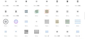
- Consistency: Icons should maintain a consistent style, size, and color palette that aligns with the design of the application. This consistency aids in reinforcing user familiarity and comfort.
Design Process
Designing effective menu icons involves several steps:
- Conceptualization: Start with brainstorming sessions to generate ideas that fit the application’s theme and purpose.
- Sketching: Draft multiple icon ideas on paper or digitally to explore different designs. Icons8 offers a variety of templates and tools that can facilitate this phase.
- Refinement: Select the most promising designs and refine them using design software like Adobe Illustrator or Sketch, both recommended by Icons8.
- Prototyping: Integrate icons into the user interface to see how they function within the layout.
- Iteration: Make necessary adjustments based on visual appeal and functionality.

Adapting Icons for Different Applications
Icons must be versatile to be effective across different platforms:
- Platform Considerations: Design considerations vary between web, mobile, and desktop applications. For instance, mobile icons require more simplicity due to smaller display sizes.
- Scalability: Icons should be scalable to ensure they are clear and distinct across all screen resolutions.
User Testing and Feedback
Testing menu icons with actual users is crucial. This process can uncover unforeseen issues with icon design that might not be apparent to designers. Collect feedback through user testing sessions and use this data to refine the icons. Effective testing ensures that icons are both functional and intuitive.
Case Studies
Examining successful menu icons can provide valuable insights. For example, consider a mobile app that significantly increased user engagement after redesigning its icons for better clarity and consistency. Analyzing such successes helps identify effective strategies and techniques for icon design.
Common Mistakes and How to Avoid Them
Common pitfalls in menu icon design include using overly complex images, inconsistent graphic styles, or colors that fail to stand out. To avoid these, adhere to the principles of simplicity and test designs thoroughly. Keeping user interface guidelines in mind can also help in maintaining consistency and functionality.
Conclusion
Crafting perfect menu icons is an art that balances aesthetic appeal with functionality. By adhering to fundamental design principles, utilizing a thoughtful design process, and incorporating user feedback, designers can create icons that enhance the user experience across any application. Icons8 provides the tools, tips, and examples necessary to innovate within these parameters, helping you produce menu icons that are not only visually appealing but also functionally superb across various user interfaces. Always aim for clarity, simplicity, and consistency, and remember that the best icons are those that users don’t even have to think about using.