The Importance of Library Icons
Introduction
In today’s digital age, where information is readily available at our fingertips, the role of libraries may seem diminished. However, libraries continue to play a crucial role in our society as guardians of knowledge and promoters of literacy. To enhance the user experience and facilitate access to information, library icons have become an essential element in modern library systems. In this article, we will explore the importance of library icons and how they contribute to the overall functionality and usability of libraries.
Understanding Library Icons
Library icons are graphical representations used in library systems to symbolize specific actions, functions, or categories. These icons serve as visual indicators that help users quickly understand and navigate through library interfaces. They are typically simple and easily recognizable, conveying information at a glance.
Enhancing User Experience
One of the primary purposes of library icons is to enhance the user experience. By using intuitive symbols, icons enable users to quickly identify and understand the various features and functions within a library system. This improves efficiency and reduces the learning curve for library users, especially for those who may be unfamiliar with the interface.
Visual Cues for Navigation
Library icons act as visual cues for navigation, guiding users to different sections or services within the library system. Whether it’s locating specific collections, accessing search functions, or navigating through different pages, icons provide a clear visual path for users to follow.
Iconography and Branding
Library icons also contribute to the overall branding and visual identity of libraries. By using consistent and recognizable icons across different platforms and materials, libraries can establish a cohesive brand image. This helps create a sense of familiarity and trust among users, reinforcing the library’s reputation and values.
Accessibility and Inclusivity
Inclusive design is a critical aspect of modern library systems, and library icons play a role in ensuring accessibility for all users. Icons that comply with accessibility standards, such as color contrast and clarity, can improve usability for individuals with visual impairments or color blindness. Well-designed icons can also transcend language barriers, making library systems more accessible to diverse populations.
Cross-Platform Consistency
With libraries expanding their digital presence across various platforms, maintaining consistency in design and user experience is vital. Library icons provide a consistent visual language that can be utilized across websites, mobile apps, and other digital interfaces. This consistency helps users navigate seamlessly between different platforms, creating a cohesive and familiar experience.
Improving Search and Discoverability
Library icons aid in improving search and discoverability within library systems. By associating specific icons with particular categories or functions, users can quickly locate desired information or services. Icons make the process of browsing and searching more efficient, saving users’ time and effort.
Simplifying Complex Functions
Library systems often include complex functions that can be overwhelming for users. Library icons simplify these functions by representing them visually, making them more approachable and easier to understand. By reducing cognitive load, icons enable users to perform tasks with greater confidence and efficiency.
Adapting to Changing Technologies
As technology advances, libraries need to adapt and incorporate new features into their systems. Library icons provide a flexible solution for accommodating these changes. By designing icons that represent emerging technologies or concepts, libraries can seamlessly integrate new functionalities into their systems while maintaining a consistent user experience.
Customization and Personalization
Library icons can also be customized and personalized to meet the specific needs of individual users. Users may have different preferences or require additional functionalities, and icons can be adapted to reflect these preferences. Personalization options enhance user satisfaction and allow libraries to cater to diverse user preferences.
Enhancing Visual Appeal
Library icons contribute to the overall visual appeal of library systems. Well-designed icons can make the interface more engaging and aesthetically pleasing. By incorporating visually appealing icons, libraries can create a positive and inviting atmosphere that encourages users to explore and interact with the system.
Promoting Digital Literacy
In an increasingly digital world, libraries play a crucial role in promoting digital literacy. Library icons serve as visual aids that guide users through the digital landscape, teaching them how to navigate and interact with various technologies. By using icons, libraries empower users to become more digitally literate and confident in their information-seeking abilities.
Icons as Cultural Symbols
Library icons can also carry cultural significance and act as symbols of shared values and traditions. Certain icons, such as the book or the globe, represent knowledge and global awareness. By incorporating these icons, libraries can convey their commitment to education, cultural exchange, and intellectual growth.
Maintaining a Sense of Tradition
While libraries embrace technological advancements, they also strive to maintain a sense of tradition and heritage. Library icons can incorporate elements that pay homage to the physical library experience, such as bookshelves or reading lamps. These icons serve as reminders of the rich history and enduring importance of libraries in our society.
Conclusion
Library icons play a pivotal role in modern library systems, enhancing the user experience, improving navigation, and contributing to the overall branding and accessibility of libraries. By utilizing well-designed icons, libraries can simplify complex functions, adapt to changing technologies, and promote digital literacy. These icons not only serve as visual aids but also act as cultural symbols, representing the values and traditions that libraries uphold. As libraries continue to evolve in the digital age, the importance of library icons will only grow, ensuring that libraries remain accessible, user-friendly, and relevant for generations to come.
FAQs
1. Can library icons be customized to match a library’s branding? Yes, library icons can be customized to align with a library’s branding and visual identity. This helps create a consistent and recognizable image across different platforms and materials.
2. Are library icons only used in digital library systems? No, library icons can also be used in physical library environments to provide visual cues for navigation and categorization of materials.
3. How do library icons contribute to accessibility? Library icons that adhere to accessibility standards, such as high contrast and clarity, can improve usability for individuals with visual impairments or color blindness.
4. Can library icons be translated into different languages? While library icons are generally designed to be language-agnostic, they can be associated with labels or text in different languages to ensure clarity and comprehension.
5. What is the future of library icons? As libraries continue to embrace new technologies and expand their digital presence, library icons will likely evolve to incorporate emerging concepts and functionalities, further enhancing the user experience.
Convenient Library Icon Packs on Icons8 Website
Icons play a vital role in web and graphic design, adding visual appeal and enhancing user experience. When it comes to finding high-quality and convenient icon packs, the Icons8 website stands out as a valuable resource. With its extensive collection and user-friendly interface, Icons8 offers an impressive array of icon packs suitable for various design projects. In this article, we will explore the convenience and benefits of using library icon packs from Icons8, showcasing why it has become a go-to platform for designers and developers.
Introduction: The Importance of Icon Packs
In today’s digital landscape, icons serve as visual cues that aid users in understanding and navigating through interfaces. Icon packs are collections of pre-designed icons that offer convenience and consistency in design. They save time and effort by providing a wide range of ready-to-use icons, eliminating the need to create them from scratch.
Overview of Icons8 Website
The Icons8 website is a comprehensive platform that hosts an extensive library of icon packs, catering to diverse design requirements. With its intuitive interface and user-friendly layout, the website makes it easy for designers and developers to explore and access the desired icon packs.
Easy Navigation and Search Functionality
Icons8 offers a seamless browsing experience with its well-organized categories and intuitive search functionality. Users can effortlessly navigate through various icon styles and categories, ensuring they find the perfect icons for their projects. The search feature allows for precise filtering based on keywords, colors, and styles, saving valuable time during the design process.
Wide Range of Icon Styles
One of the key strengths of Icons8 is its diverse range of icon styles. Whether you’re looking for flat icons, material design icons, or hand-drawn icons, Icons8 has you covered. Each style offers a unique visual aesthetic, allowing designers to choose the one that best fits their project requirements.
Customization Options
Icons8 recognizes the need for customization in design. To meet this demand, the platform provides users with customization options for selected icon packs. Designers can easily adjust the size, color, and even add overlays or effects to the icons, ensuring a seamless integration with their design themes.
Scalability and Compatibility
Icons8 icon packs are designed to be scalable and compatible with various platforms and devices. The icons are available in different file formats, including SVG, PNG, EPS, and PDF, allowing for easy integration into websites, mobile applications, presentations, and other design projects. Their scalable nature ensures that the icons retain their visual quality regardless of the size or resolution.
Icons8 API Integration
For developers and advanced users, Icons8 offers an API that allows seamless integration of their icon packs into different software applications. This feature enables the automatic retrieval and implementation of icons, further streamlining the design process and enhancing productivity.
Quality Assurance and Regular Updates
Icons8 places a strong emphasis on quality assurance, ensuring that all the icons in their library meet high standards. The platform regularly updates and expands its collection, introducing new icon packs and maintaining the relevance of existing ones. This commitment to quality guarantees that designers have access to the latest and most visually appealing icons.
Licensing and Usage
Icons8 provides flexible licensing options, allowing users to choose the most suitable license for their specific needs. Whether it’s for personal, commercial, or open-source projects, Icons8 offers affordable and transparent licensing, granting users the necessary permissions to use the icons legally.
Pricing Options
Icons8 offers both free and premium pricing options. The free plan provides access to a limited selection of icons, while the premium plans unlock additional features, including access to the entire library, offline usage, and advanced customization options. The pricing plans are designed to cater to different budgets and project requirements, ensuring accessibility for designers at all levels.
Customer Support and Community
Icons8 values its users and provides excellent customer support. Users can reach out to the Icons8 team for assistance or to report any issues. Additionally, Icons8 has an active community forum where designers and developers can interact, share insights, and seek inspiration, fostering a collaborative and supportive environment.
Benefits of Using Icon Packs
Using icon packs from Icons8 offers numerous benefits for designers and developers:
- Time-saving: Icon packs provide ready-to-use icons, eliminating the need for manual design work.
- Consistency: Icon packs ensure visual consistency throughout the design, enhancing the overall user experience.
- Enhanced aesthetics: Icons8 offers a wide range of visually appealing styles, allowing designers to create stunning interfaces.
- Scalability: Icons8 icons are scalable, ensuring they look crisp and clear on different devices and screen sizes.
- Customization: The customization options provided by Icons8 allow designers to tailor the icons to their specific design needs.
Case Studies: Successful Implementations
Numerous designers and developers have benefited from using Icons8 icon packs in their projects. Here are some real-world examples of successful implementations:
- Company X increased user engagement by integrating Icons8’s flat icons into their mobile application’s UI.
- Website Y improved its visual appeal and navigation by utilizing Icons8’s material design icons in their website redesign.
- App Z enhanced its branding and user experience by incorporating Icons8’s hand-drawn icons into their interface.
Conclusion
Icons8’s library of convenient icon packs offers a valuable resource for designers and developers seeking high-quality icons for their projects. With its user-friendly website, extensive range of styles, customization options, and compatibility, Icons8 stands as a reliable and convenient platform for all icon needs. By leveraging the power of icon packs, designers can save time, ensure consistency, and create visually appealing interfaces that enhance the user experience.
FAQs (Frequently Asked Questions)
Q1: Are the icons from Icons8 free to use? Yes, Icons8 offers a free plan that allows access to a limited selection of icons. However, premium plans are available for unlocking the full library and additional features.
Q2: Can I customize the icons to match my design requirements? Absolutely! Icons8 provides customization options for selected icon packs, allowing you to adjust size, color, and apply overlays or effects.
Q3: Are Icons8 icons compatible with different design software? Yes, Icons8 icons are available in various file formats (SVG, PNG, EPS, PDF) and are compatible with different design software applications.
Q4: How frequently does Icons8 update its icon library? Icons8 regularly updates and expands its icon library, ensuring users have access to the latest and most visually appealing icons.
Q5: Does Icons8 offer customer support? Yes, Icons8 provides excellent customer support. You can reach out to their team for assistance or to report any issues.
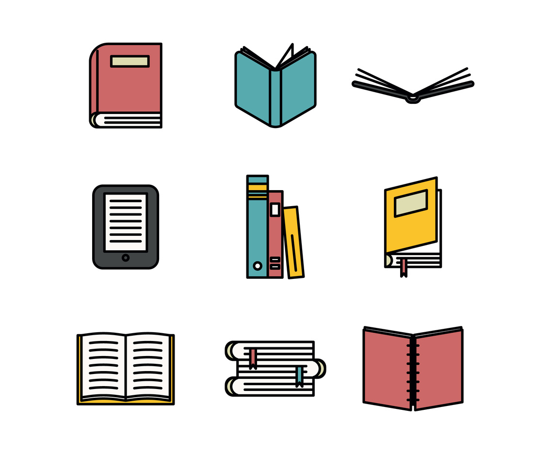
Modern Flat Library Icons
In today’s digital age, visuals play a crucial role in capturing attention and conveying information effectively. Icons, in particular, have become an integral part of modern design, providing users with intuitive and visually appealing representations of various concepts. When it comes to libraries, the use of modern flat icons has gained significant popularity. In this article, we will explore the world of modern flat library icons, their benefits, and how they enhance user experience.
In a world where information overload is prevalent, visual communication has become increasingly important. Visual elements, such as icons, aid in simplifying complex concepts and facilitating quick comprehension. Modern flat library icons have emerged as a popular choice for designers and developers to enhance user experience and streamline interactions within library interfaces.
Understanding Modern Flat Icons
Modern flat icons are minimalistic, two-dimensional icons that focus on simplicity and clarity. They have a clean and straightforward design aesthetic, devoid of intricate details or shadows. These icons utilize bold colors, sharp edges, and geometric shapes to convey their intended meaning effectively.
The Rise of Modern Flat Library Icons
The rise of modern flat library icons can be attributed to several factors. Firstly, their simplicity aligns with the minimalist design trend, which favors clean interfaces and user-friendly experiences. Additionally, flat icons load quickly and are easily scalable, making them ideal for responsive and mobile-friendly designs. Moreover, their versatile nature allows them to adapt to various design styles and themes seamlessly.
Benefits of Using Modern Flat Library Icons
Using modern flat library icons offers numerous benefits to both designers and users:
1 Enhanced User Experience
Modern flat icons enhance user experience by providing visual cues that aid in navigation and understanding. Their simplicity and clarity make them easily recognizable and accessible, contributing to a seamless user interface.
2 Consistent Visual Language
By utilizing a set of modern flat library icons, designers can establish a consistent visual language throughout a library’s interface. This consistency improves usability and ensures that users can quickly interpret and interact with different elements.
3 Improved Readability
Icons play a vital role in enhancing the readability of a library interface. Modern flat icons, with their clean design and unambiguous representations, assist users in identifying key features, functions, and categories effortlessly.
4 Scalability and Adaptability
Modern flat icons are scalable, allowing them to maintain their visual integrity across different screen sizes and resolutions. They can seamlessly adapt to various devices, ensuring a consistent experience for users.
5 Branding and Identity
Customizable modern flat library icons provide an opportunity for libraries to establish a unique visual identity. By incorporating their branding elements into the icons, libraries can reinforce their brand and create a memorable experience for users.
Design Principles for Effective Iconography
To create effective modern flat library icons, designers should consider the following principles:
1 Clarity and Simplicity
Icons should convey their intended meaning instantly. Keeping the design simple and removing unnecessary details ensures clarity and enhances usability.
2 Consistency
Maintaining a consistent style, size, and visual language across all icons within a library interface helps users navigate with ease and understand the functionality of different elements.
3 Metaphors and Visual Associations
Icons can leverage metaphors and visual associations to communicate abstract concepts. Using familiar imagery helps users quickly grasp the purpose and functionality of icons.
4 Contrast and Color
Bold colors and high contrast aid in drawing attention and increasing legibility. Designers should choose colors that align with the library’s brand and create a harmonious visual hierarchy.
How to Incorporate Modern Flat Library Icons
To incorporate modern flat library icons effectively:
- Determine the key functions and features of the library interface.
- Identify the categories and elements that require visual representation.
- Select or create a set of modern flat library icons that align with the library’s visual language.
- Implement the icons consistently across the interface, ensuring their appropriate placement and sizing.
- Test the usability and readability of the icons with a diverse user base and make necessary adjustments based on feedback.
Examples of Modern Flat Library Icons in Libraries
Modern flat library icons find application in various areas within libraries, including:
- Book categorization and genres
- Search and discovery functionalities
- User account management
- Digital content access and downloads
- Library events and programs
- Reference and research assistance
By incorporating these icons thoughtfully, libraries can create an intuitive and visually engaging interface for their users.
Best Practices for Designing Modern Flat Library Icons
When designing modern flat library icons, consider the following best practices:
- Use recognizable symbols and avoid ambiguity.
- Ensure consistent stroke widths and proportions.
- Opt for a limited color palette that complements the library’s branding.
- Test the icons on different devices and screen sizes for scalability and legibility.
- Seek user feedback to iteratively improve the icon designs.
Challenges and Considerations
While modern flat library icons offer numerous advantages, designers should be mindful of the following challenges and considerations:
- Balancing simplicity with conveying the intended meaning can be a delicate process.
- Icons may not always be universally understood, requiring clear visual cues and tooltips for accessibility.
- Libraries with diverse user bases should consider cultural sensitivity and inclusivity when designing icons.
Future Trends in Modern Flat Icon Design
As technology evolves, modern flat icon design is expected to embrace new trends and possibilities. Some anticipated future trends include:
- Dynamic and interactive icons that respond to user interactions.
- Integration of animated elements to provide visual feedback and enhance engagement.
- Personalization options for users to customize their icon sets.
- Integration of augmented reality (AR) and virtual reality (VR) elements into icons for immersive experiences.
Conclusion
Modern flat library icons have revolutionized the way libraries communicate and interact with their users. With their simplicity, versatility, and ability to enhance user experience, these icons have become an essential tool for designers and developers. By incorporating modern flat library icons thoughtfully and following design principles, libraries can create visually engaging interfaces that simplify navigation and improve usability.
FAQs (Frequently Asked Questions)
Q1: How can modern flat library icons improve user experience? Modern flat library icons enhance user experience by providing visual cues for navigation, improving readability, and establishing a consistent visual language throughout the library interface.
Q2: Can modern flat library icons be customized to match a library’s branding? Yes, modern flat library icons can be customized to align with a library’s branding, reinforcing its visual identity and creating a cohesive user experience.
Design Custom Resume Icons
In today’s competitive job market, having a standout resume is essential. One effective way to make your resume visually appealing and unique is by incorporating custom icons. Custom resume icons can help highlight important sections, make your resume more visually engaging, and leave a lasting impression on potential employers. In this article, we will explore the benefits of using custom resume icons and provide practical tips for designing them.
Table of Contents
- Introduction
- Importance of Visual Appeal in Resumes
- Benefits of Custom Resume Icons
- Designing Custom Resume Icons
- 4.1 Brainstorming Icon Ideas
- 4.2 Sketching and Conceptualizing
- 4.3 Choosing a Style and Color Palette
- 4.4 Using Vector Graphics Software
- 4.5 Ensuring Consistency and Clarity
- Placing Icons in Your Resume
- Best Practices for Using Custom Resume Icons
- Tools and Resources for Icon Design
- Conclusion
- FAQs
1. Introduction
When it comes to job applications, first impressions matter. A well-designed resume can make a significant impact on a hiring manager and differentiate you from other candidates. Custom resume icons offer a creative way to showcase your skills, experience, and personal brand.
2. Importance of Visual Appeal in Resumes
In today’s visually-oriented world, visual appeal plays a crucial role in capturing attention. A visually appealing resume can make information easier to digest, break up text-heavy sections, and create a memorable impression. Custom icons can be used to represent different sections such as education, work experience, skills, and contact information.
3. Benefits of Custom Resume Icons
3.1 Enhanced Readability
Custom icons serve as visual cues that draw attention to specific resume sections. By using icons to represent different categories, you can improve the overall readability of your resume. Hiring managers can quickly scan through the document and identify relevant information.
3.2 Increased Visual Engagement
Including custom icons in your resume adds an element of visual interest, making it more engaging and memorable. Icons can help create a cohesive design, aligning with your personal branding and leaving a lasting impression on potential employers.
3.3 Showcasing Creativity and Attention to Detail
Custom resume icons provide an opportunity to showcase your creativity and attention to detail. By designing unique icons that reflect your personality and professional style, you can demonstrate your ability to think outside the box and pay attention to even the smallest details.
4. Designing Custom Resume Icons
Designing custom resume icons involves several steps to ensure they align with your overall resume design and effectively communicate information. Here is a step-by-step guide to help you create visually appealing and professional icons:
4.1 Brainstorming Icon Ideas
Start by brainstorming icon ideas that are relevant to the sections of your resume. Consider using symbols or objects that represent each category, such as a graduation cap for education, a briefcase for work experience, or a computer for technical skills. Make a list of potential icon concepts to explore further.
4.2 Sketching and Conceptualizing
Once you have your list of icon ideas, begin sketching them out on paper or using digital tools. Focus on creating simple and recognizable shapes that effectively convey the intended meaning. Experiment with different variations until you find the most suitable design for each icon.
4.3 Choosing a Style and Color Palette
Select a style and color palette that aligns with your overall resume design and personal branding. Consider the tone and industry of the job you’re applying for. For example, if you’re in a creative field, you might opt for bold and vibrant colors, while a more conservative industry may call for a more subtle and professional color scheme.
4.4 Using Vector Graphics Software
Once you have finalized your sketches, transfer them to vector graphics software such as Adobe Illustrator or Inkscape. These tools allow you to create scalable icons that retain their quality regardless of the size. Ensure your icons are clear, legible, and well-balanced.
4.5 Ensuring Consistency and Clarity
Maintain consistency throughout your icon set by using the same style, stroke weight, and color palette. Icons should be easily recognizable and clearly represent their corresponding categories. Avoid using overly complex designs that may be difficult to interpret or distract from the resume content.
5. Placing Icons in Your Resume
Strategic placement of custom icons can enhance the visual flow and organization of your resume. Consider placing icons next to relevant section headings or within bullet points to create a visually appealing hierarchy. Ensure the icons are aligned properly and have enough spacing to maintain readability.
Best Practices for Using Custom Resume Icons
- Limit the number of icons to maintain a clean and professional look.
- Use consistent and recognizable symbols to convey meaning.
- Ensure the icons are visually balanced and proportional.
- Test the legibility of your icons at various sizes.
- Optimize the file size of your icons for web or digital applications.
Tools and Resources for Icon Design
- Adobe Illustrator: A powerful vector graphics software for creating custom icons.
- Inkscape: A free and open-source alternative for vector graphics design.
- Canva: An online design tool with a wide range of icon templates.
- Flaticon: A database of free icons that can be customized and downloaded.
Conclusion
Custom resume icons offer a creative and visually appealing way to enhance your resume and make it stand out from the competition. By designing icons that align with your personal branding and effectively communicate information, you can leave a lasting impression on potential employers. Remember to keep the icons consistent, legible, and visually balanced throughout your resume.
9. FAQs
Q1: Can I use custom resume icons in an online job application? A1: Yes, custom resume icons can be used in both online and offline job applications. However, ensure that the file format and size are suitable for digital submission.
Q2: How many custom icons should I include in my resume? A2: It’s best to limit the number of custom icons to maintain a clean and professional look. Aim for one or two icons per resume section.
Q3: Can I use pre-made icons for my resume? A3: While pre-made icons can be a time-saving option, designing custom icons allows for greater personalization and creativity. Consider customizing existing icons to match your unique style.
Q4: What file format should I use for custom resume icons? A4: PNG or SVG formats are commonly used for custom icons. PNG works well for web or digital applications, while SVG is scalable without losing quality.
Q5: Should I use the same set of icons for every resume? A5: It’s recommended to use the same set of icons across your resume for consistency. However, you can make minor adjustments to suit different resume formats or industry-specific requirements.