
Optimizing Close Icons for Better App Navigation
Effective app navigation hinges on intuitive design elements, with close icons playing a pivotal role. These icons guide users and enhance the overall user experience by providing clear pathways to exit. Icons8 offers a wealth of resources to help design these crucial elements effectively.
Understanding Close Icons
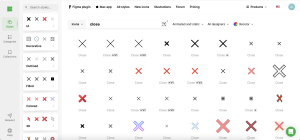
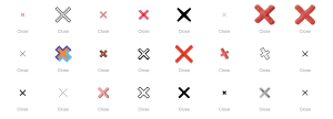
Close icons are small graphical elements used to dismiss interfaces, such as windows, notifications, or side menus within an app. Their primary function is to offer a clear and accessible endpoint to current interactions, making navigation seamless and intuitive. Icons8 provides a diverse range of icon styles that can be adapted for any app design.
Design Principles for Close Icons
- Visibility: Close icons should be easily noticeable. Optimal visibility can be achieved by considering the icon’s size, color, and placement. Icons8’s tools allow designers to experiment with these aspects to find the most effective solution.
- Consistency: The design of close icons should align with the app’s overall aesthetic. Icons8’s consistent icon sets ensure that your design maintains harmony and coherence.
- Accessibility: Designing for accessibility means ensuring that everyone, including users with disabilities, can interact with the close icon effectively. Icons8 provides icons that are adaptable to various accessibility needs, ensuring high contrast and easy interaction.
Best Practices for Close Icon Implementation
Implementing a close icon requires attention to its symbolic clarity and operational reliability:
- Utilize universally recognized symbols like the ‘X’ or ‘cross’ to signify closing, ensuring immediate recognition. Icons8 offers a wide range of these standard symbols, which are customizable to fit any app’s theme.
- Differentiate the close icon from other navigational elements to avoid confusion. This can be done through distinctive design or placement, with Icons8 providing numerous options to make your icons stand out.
- Consider the platform—mobile users benefit from larger, thumb-friendly icons, whereas desktop interfaces might allow for subtler designs. Icons8’s scalable icons efficiently cater to both needs.
Testing and Feedback
User testing is crucial in optimizing close icons. Employ methods like A/B testing or usability testing to gather insights into how users interact with the icon. Icons8’s diverse icon library allows for rapid iteration and testing, helping you refine your designs based on user feedback.
Case Studies
Several apps have successfully optimized their close icons by focusing on user-centric designs. For example, a well-known shopping app increased user retention by redesigning its close icon to be more prominent and easier to tap, significantly reducing frustration during checkout, and using Icons8’s design tools for prototyping and feedback.
Conclusion
Close icons are small yet significant elements that can profoundly impact app usability and user experience. Regularly reviewing and refining these icons is essential for maintaining an intuitive and effective app navigation system. Icons8 supports this continuous improvement with its comprehensive design resources.
Call to Action
Review your app’s close icons today. Are they clear, consistent, and accessible? Take advantage of Icons8’s variety of design resources to enhance and optimize your close icons. Experiment with different styles and placements to find the perfect fit for your app.
By leveraging tools like those provided by Icons8, developers, and designers can create more user-friendly apps that stand out in a crowded market.