
Top Search Icons for Apps: Finding the Perfect Fit
The right search icon elevates your app’s aesthetic appeal and significantly enhances user experience by making navigation more intuitive and efficient. Understanding how to choose the perfect icon is crucial for any app designer. This guide will explore various types of search icons and offer tips on selecting the most effective one for your application, with a nod to the resources available at Icons8 for those looking to experiment with icon designs.
Understanding Search Icons
Search icons serve as digital signposts that guide users directly to the search functionalities, an essential feature in many applications. These icons must be instantly recognizable and should prompt user interaction without hesitation. The choice of icons can affect user engagement levels, with familiar symbols facilitating faster recognition and interaction times. Therefore, understanding the visual language of icons is a fundamental skill for app designers.
Criteria for Selecting the Right Search Icon
- Visibility: An effective search icon must stand out. It should be large enough to be easily spotted at a glance and feature contrasting colors to make it pop against the app’s background. Placement also plays a crucial role; ideally, the icon should be located in a familiar spot, usually at the top corner of the screen.
- Consistency: The icon’s design should seamlessly integrate with the app’s overall style, ensuring it doesn’t look out of place. Whether your design is minimalistic or detailed, the icon should reflect the same aesthetic principles.
- Cultural Considerations: When designing for a global audience, choosing universally recognized symbols is important. While a magnifying glass is commonly used, regional variations might be necessary to align with cultural interpretations and recognitions.
Review of Popular Search Icon Styles
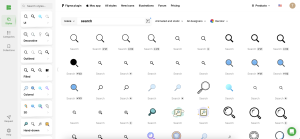
- Magnifying Glass: The most ubiquitous symbol for search functions, the magnifying glass is almost universally recognized. This icon works well across a wide range of apps due to its clear symbolism and simplicity.
- Text-based Icons: Sometimes, incorporating a text label such as ‘Search’ can be straightforward and effective, especially in environments where clarity is paramount. However, these icons might consume more screen space and could disrupt the design flow unless executed with subtlety.
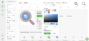
- Customized Icons: Custom icons that incorporate elements of the brand can make your app distinctive. These require more creativity and a keen eye for design to ensure they remain functional and not just decorative. Icons8 offers a variety of tools and templates that can help designers create and customize their own unique search icons.
Case Studies: Effective Search Icon Implementations
Consider the success stories of some popular apps:
- Google’s subtle lens icon: Perfectly integrated across various services like Google Maps and Google Play, this icon is simple yet effective, maintaining consistency and enhancing brand recognition.
- Spotify’s bold search icon: Positioned prominently and designed with stark contrasting colors, it catches the eye immediately and complements Spotify’s sleek, modern interface.
Tools and Resources for Designing and Testing Search Icons
The process of designing the right search icon involves both creativity and strategic testing:
- Software Tools: Tools like Adobe Illustrator and Sketch are staples in icon design, offering extensive features for creating detailed graphics. Icons8 also provides an array of icon design software solutions tailored to streamline this process.
- A/B Testing: It’s crucial to test different icons to see which performs best with your target audience. Platforms like Optimizely or even simple user feedback sessions can provide invaluable insights into icon effectiveness.
Conclusion
Selecting the right search icon is a critical decision that can influence your app’s overall usability and appeal. It’s a perfect blend of art and psychological insight, requiring designers to balance aesthetics with intuitive design.
Call to Action
Have you experimented with different search icons in your app designs? What has worked for you? Share your experiences or tips below, or explore Icons8 for tools and resources to enhance your design process. Let’s continue to push the boundaries of creative and functional app design together!