
Tick Icons: A Visual Language for Success in UI/UX Design
In the ever-evolving landscape of user interface (UI) and user experience (UX) design, the significance of visual communication cannot be overstated. Every pixel on the screen plays a role in guiding user interactions, conveying information, and shaping perceptions. Among the plethora of design elements, tick icons stand out as powerful tools in establishing clarity, efficiency, and trust within digital interfaces. In this blog post, we delve into the profound impact of tick icons as a visual language for success in UI/UX design.
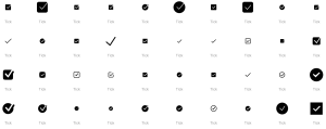
Understanding Tick Icons
![]()
Tick icons, often represented by a simple checkmark symbol, serve a fundamental purpose in UI/UX design: indicating success, completion, or affirmation. They are universally recognized symbols that communicate positive outcomes or actions within interfaces. Whether it’s confirming a successful transaction, validating user input, or acknowledging completion of a task, tick icons play a crucial role in enhancing user understanding and satisfaction.
Clarity and Guidance
At the core of effective UI/UX design lies the principle of clarity. Users should be able to navigate through interfaces effortlessly, understanding each step of their journey. Tick icons contribute to this clarity by providing visual cues that guide users along their desired path. For instance, in a multi-step form, a tick icon next to a completed section signals to the user that they have successfully progressed, instilling confidence and reducing uncertainty.
Feedback and Affirmation
In the realm of user interactions, feedback is invaluable. It reassures users that their actions have been recognized and processed by the system. Tick icons serve as instant feedback mechanisms, affirming user inputs or actions. Whether it’s submitting a form, saving changes, or subscribing to a service, the presence of a tick icon confirms to users that their desired action has been successfully executed, fostering a sense of accomplishment and trust.
Streamlining User Flows
In UI/UX design, efficiency is paramount. Every unnecessary step or ambiguity can lead to frustration and disengagement. Tick icons contribute to streamlining user flows by eliminating ambiguity and reducing cognitive load. By clearly indicating completed actions or validated inputs, they help users navigate interfaces with ease, minimizing confusion and expediting the overall user experience.
Building Trust and Reliability
Trust is the cornerstone of user engagement. In an era where online interactions dominate various aspects of daily life, establishing trust within digital interfaces is non-negotiable. Tick icons play a vital role in building this trust by reinforcing the reliability and credibility of the system. When users encounter consistent feedback through tick icons, they develop confidence in the interface, leading to increased satisfaction and loyalty.
Design Best Practices
While tick icons offer numerous benefits, their effectiveness hinges on thoughtful implementation and adherence to design best practices. Here are some guidelines to maximize the impact of tick icons in UI/UX design:
- Consistency: Maintain consistency in the design and placement of tick icons throughout the interface to ensure uniformity and clarity.
- Accessibility: Ensure that tick icons are easily distinguishable and accessible to all users, including those with visual impairments, by using appropriate colors, contrast, and alternative text.
- Contextual Relevance: Use tick icons judiciously and in contexts where they provide meaningful feedback or indication of success, avoiding overuse or ambiguity.
- Animation: Consider employing subtle animations, such as a brief pulse or fade-in effect, to enhance the visibility and dynamism of tick icons without distracting the user.
- User Testing: Conduct thorough user testing to gauge the effectiveness of tick icons in guiding user interactions and addressing any usability issues or misconceptions.
Conclusion
In the intricate tapestry of UI/UX design, tick icons emerge as indispensable elements that transcend language barriers and cultural differences to communicate success and affirmation effectively. By leveraging the power of tick icons, designers can imbue interfaces with clarity, efficiency, and trust, thereby elevating the overall user experience. As we continue to innovate and refine digital interfaces, let us not overlook the profound impact of these seemingly simple yet immensely influential visual cues.